
Talcott.com
A financial brand rebuilt from the one thing that survived, the logo, then carried through new products, legal forms and a marketing portal.
| Client | Talcott Financial Group |
|---|---|
| Role | Creative Lead |
| Team | 7-12 (UX/UI designers, developers, content strategist, program manager) |
| Timeline | 6 months (2024) |
| Scope | Brand refresh and extension, brand guidelines, product naming, marketing collateral, legal forms system, website, annuity calculator, CMS |
| Methods | Brand voice and attributes, style tiles, guideline development, asset library build, template systems, design and build |
| Status | Shipped : live at talcott.com |
“We kept the logo. We rebuilt everything it touched.”
The problem
Talcott had a logo and branding that need a refresh. The firm was taking new annuity products to market in a category where trust is the product, and the materials customers actually read, from brochures to legal forms to a brand new website, had no cohesive visual or verbal system to come from.
The approach
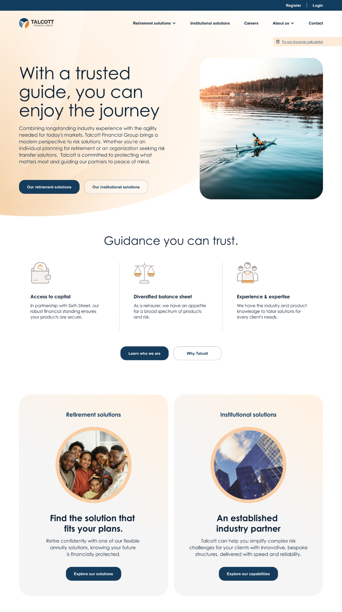
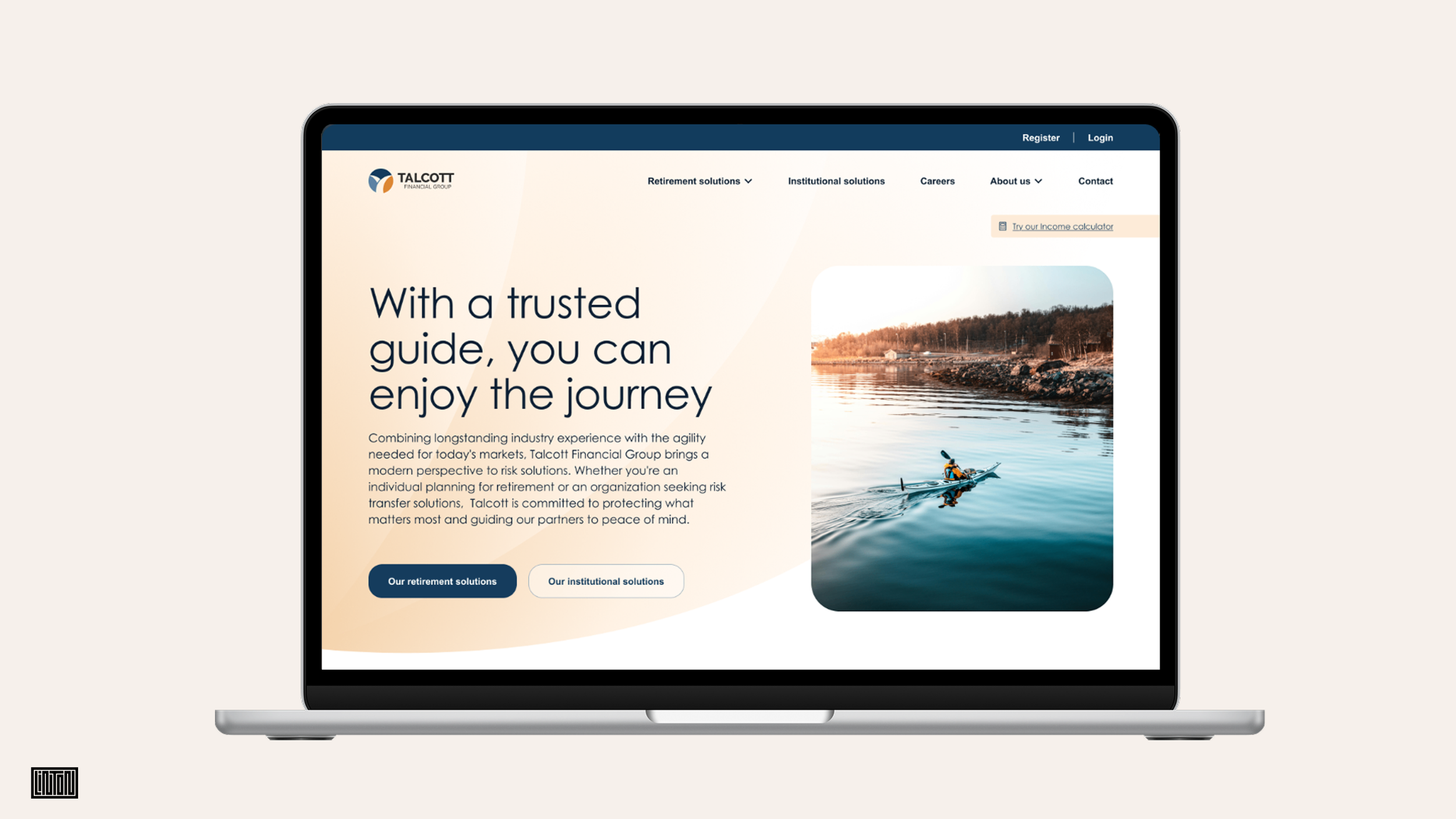
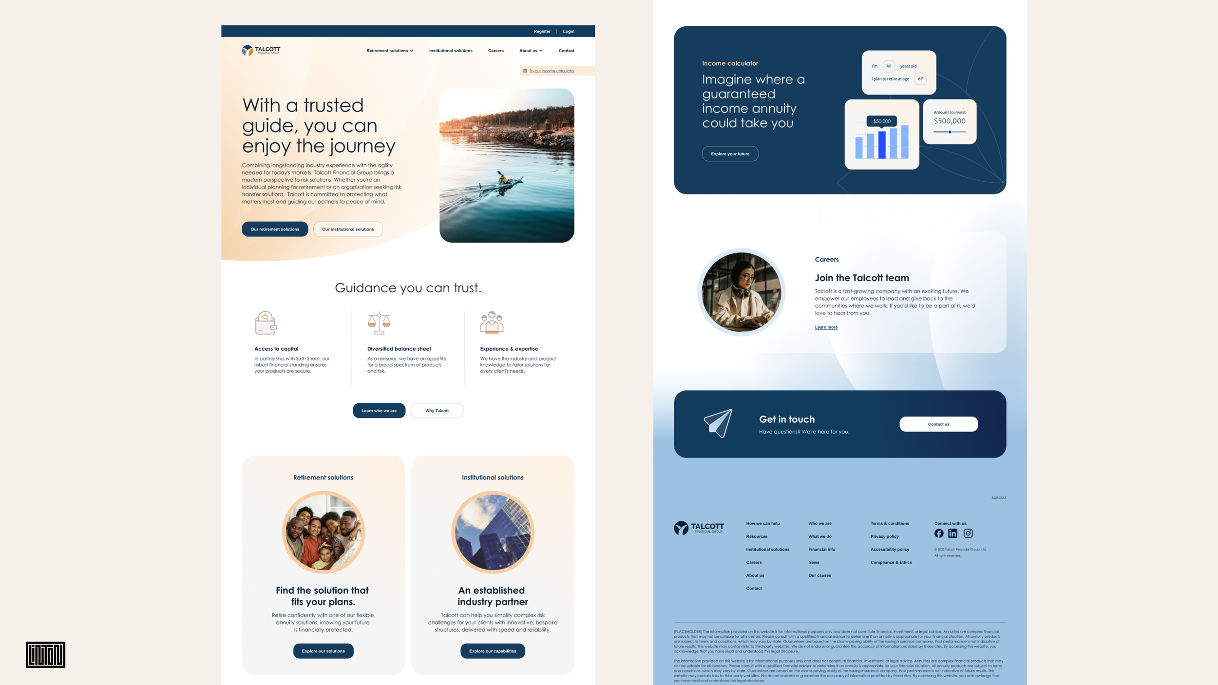
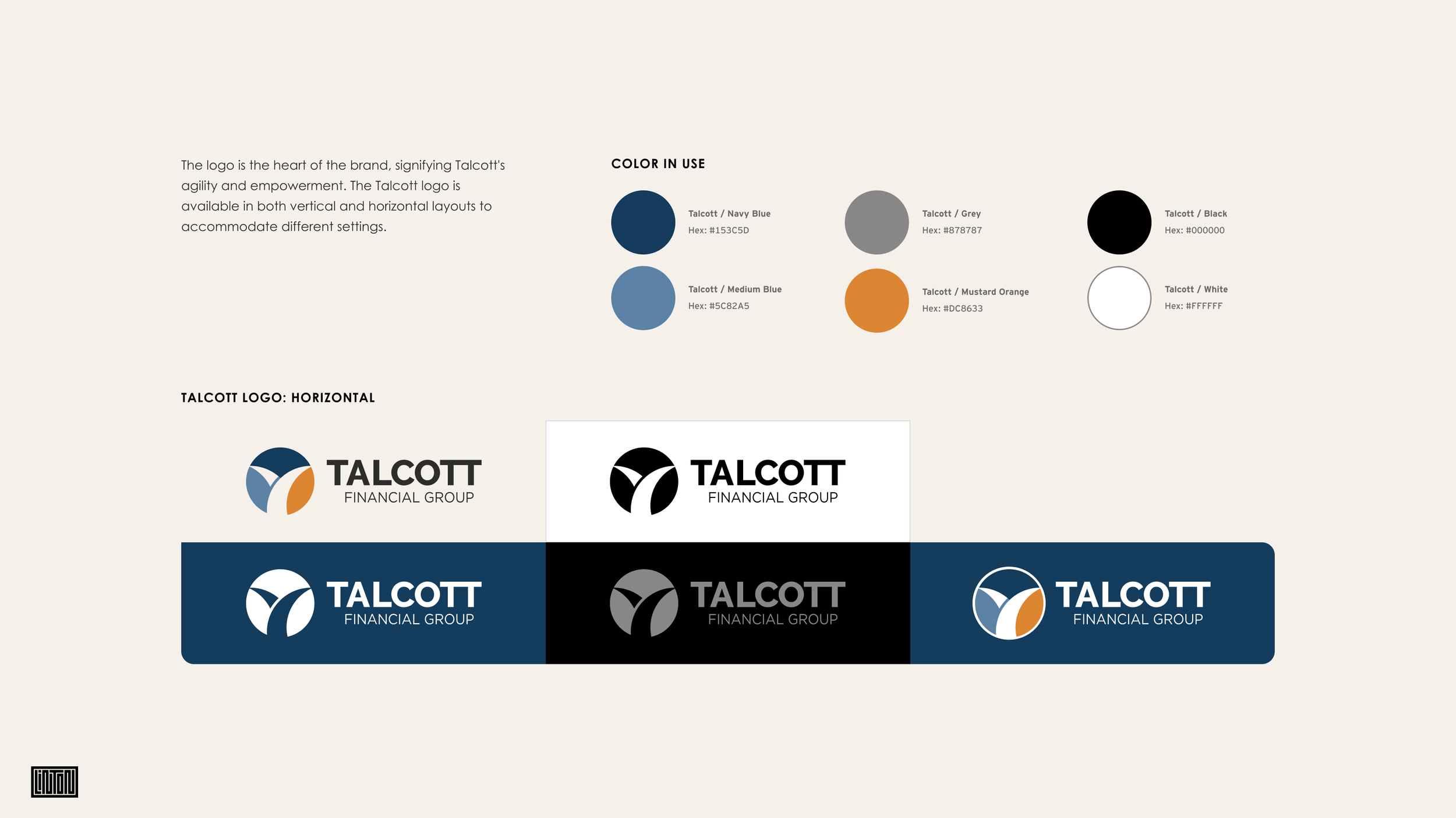
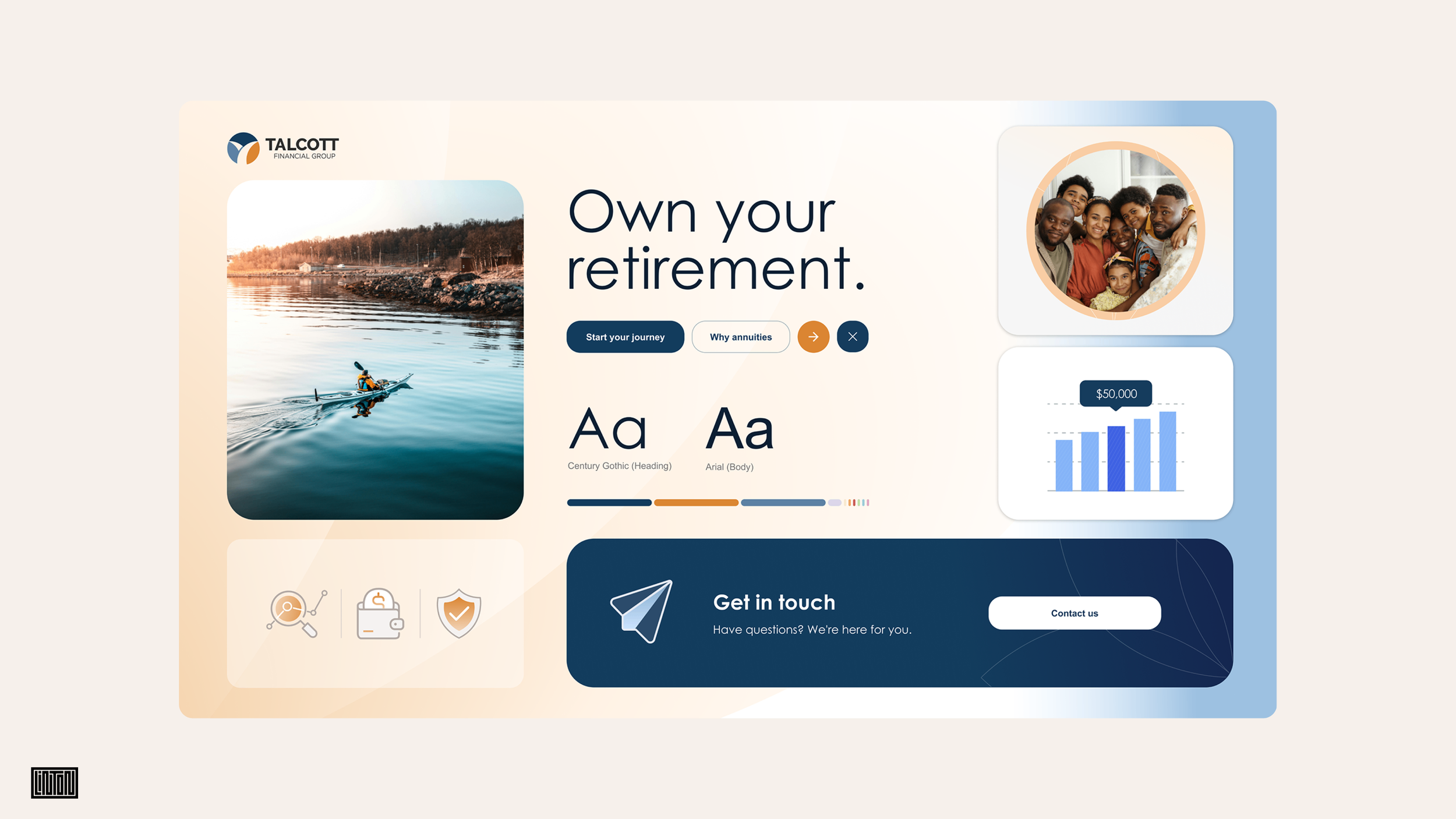
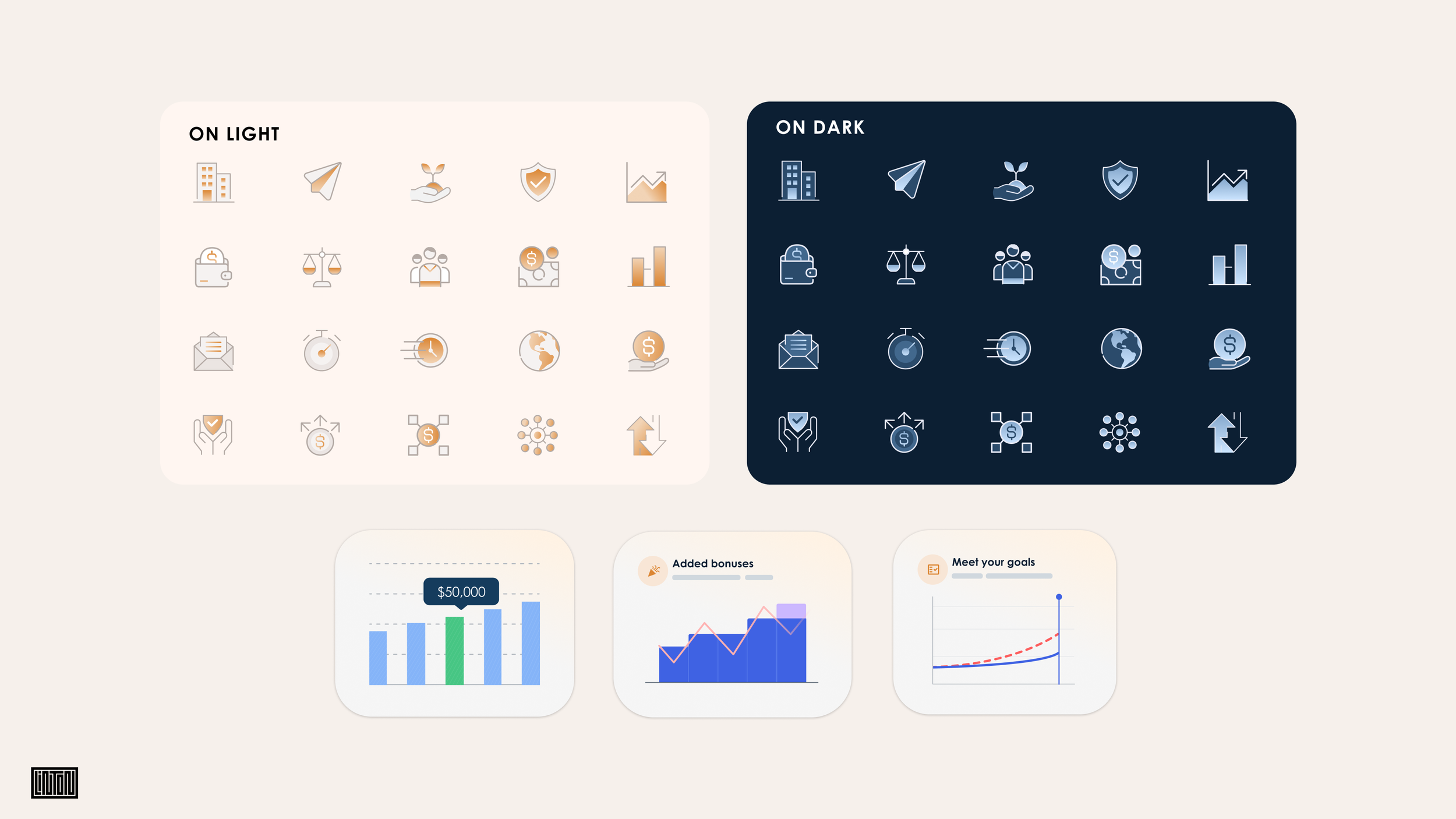
We began with voice and brand attributes, then style tiles rather than page comps, a foundation the rest could grow from. That became a new guideline document with icon and photo libraries built from scratch. From there my teams helped name and brand the annuity products and built their brochures and pages, templated the legal forms across customer types and markets, and designed and built the website, its CMS and a public annuity calculator.
We put style tiles in front of the client instead of page comps. Approving a homepage approves a homepage. Approving voice, attributes and a visual language approves everything that comes after it, so the brochures, the forms and the site were extensions of one agreed decision rather than five more rounds of it.
We treated the legal forms as a brand surface, not paperwork. Forms across customer types and markets are where most of the actual reading happens, and they are where a new brand usually dies. Flexible templates and a streamlined review process let the brand reach the documents people sign.
We kept the annuity calculator on the public site rather than behind the portal. A tool that demonstrates the value of a product belongs where prospects are, not where existing customers already are, it sits in the main navigation.
We had the product naming done in concert with the voice. Names developed alongside the brand attributes can be tested against them. Names handed over as fixed inputs can only be decorated.
The decisions
The outcome
Talcott.com is live, running the products, the calculator and the CMS behind it. An entire brand system, including voice, attributes, color, type, icon and photo libraries and guidelines, was grown from a single retained logo and now reaches from the homepage to the forms a customer signs.